I have finally been able to move my head around my front page…! It’s taken almost the entire teaching period but I have gathered some ideas on page layouts from my previous blog, I sketched and sketched but for some reason it seems to work better on the computer, so here is a snap shot of where my booklet is up to:
The first image below is how I see my front cover and contents page
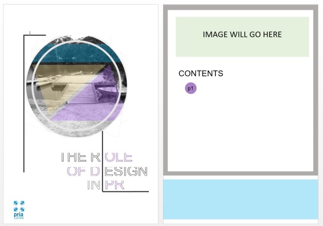
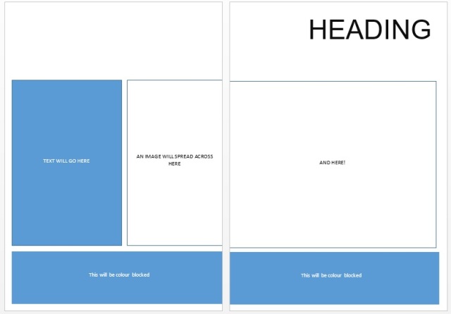
Image number two is how I see another layout
The below is how I would place an image across a double page.
I am trying to keep a similar layout across all pages, they are starting at the same/similar height, I will need to edit where the ‘Contents’ heading is, to ensure it maintains consistency throughout, which will hopefully lead it to be both aesthetically pleasing as well as easy to read, follow and understand.
All the image boxes will display an image which is relevant to the topic on that page, for example, if i am to be discussing colour, I would place an image of the colour wheel and identify the most appropriate way of selecting a colour palette for a readers eye etc.
Again, I am hoping that I am going in the right direction…..and am always open and willing for feedback on the layout of the booklet as well as the info i am planning on putting in there!

hello Reanna,
The structure and rough layout here is looking great.
Alignment of elements (same height, same margins, etc) is an important design principle because it gives the impression of order and precision. Both allow ausidences to focus their attention on what matters; so the content can be more easily accessed.
The next thing will be to begin to experiment with typefaces and type styling (point size, paragraph style, space between lines, colour of text, etc). Simultaneously you could begin to explore image selection; what image looks best where? and which images work best to communicate your intent given the headings and content? so much to think of! But if you keep referring back to found examples of good design, and see if you can analyse and emulate what they do well.
And keep in mind your objective; what are you intending to achieve with this booklet? How will the brochure communicate that intent/story?
A few things to be careful of: having text too close to the FOLD (gutter) and the EDGE (margin) of a page often looks unprofessional. There are exceptions to this rule, but in this case, having reasonable size margins will help.
Great work.
Shane
LikeLike
PS: another thing to be aware of is where the FOLD falls in relation to any photographic image which you run across that fold. For example, if I were to place a lovely photo of you running across the FOLD in your booklet and your left eye happens to fall right where the fold is, then a key aspect of the photograph will be compromised! Carefully crop and arrange each image with these things in mind.
LikeLike