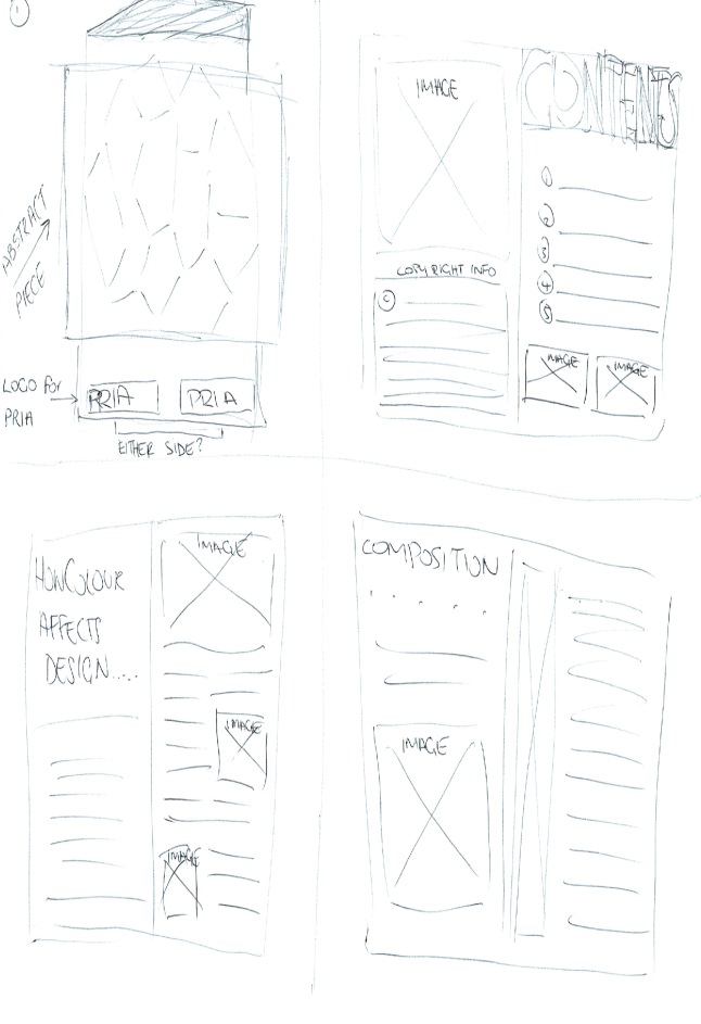
For this assessment, as I am finishing my PR degree, I chose to use the Public Relations Institute of Australia (PRIA) as my client, and chose to use a brochure to demonstrate how design plays a major role in public relations.
My plan is to have a brochure of no more than 10 pages, (possibly following either the analogous or complementary themes) which identifies and demonstrates how key components of design are a major contributing factor when developing PR campaigns.
As an example, I am going to have a section which speaks about colour. As Lidwell mentions in the chapter ‘Color’ in Universal principles of design, ‘Color is used in design to attract attention, group elements, indicate meaning and enhance aesthetics’ – while he continues to say ‘there is no substantive evidence supporting general effects of color on emotion or mood’ (Lidwell, 2010, p. 48-49) , I completely disagree, I prefer to lean more to ‘Colors, like features, follow the changes of the emotion’ (Picasso).
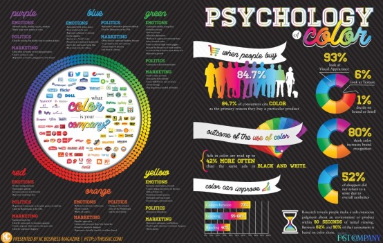
The image above is a bit of a brain dump on how exactly I want it to look, right now its a bit more on the ‘form’ side of things, rather than the function – I haven’t quite gotten around to developing the content for this colour section yet, but I find it incredibly fascinating and am really looking forward to developing each section as we go. I started to read up on the psychology of colour and how it is used in marketing etc. I found some interesting infographics below and while there is still a lot of research to be done in this field, i definitely think there is A LOT of merit in it…..!
sourced from: visually
(sourced from: thisiskc.com)
——————————————
Resources
Lidwell, W. Holden, K. Butler, J. 2010, Universal Principles of design: 125 ways to enhance usability, influence perception, increase appeal, make better design decisions, and teah through design. Beverly Mass. Referenced from http://site.ebrary.com.ezproxy.lib.swin.edu.au/lib/swin/reader.action?docID=10715587
This is kc – http://www.thisiskc.com/2014/08/infographic-psychology-of-color-marketing-business-logos/
Visually – http://visual.ly/color-psychology-brands


Great work Reanna,
I’m not going to give detailed feedback on anyone’s blog posts (Assessment 1) until after everyone has had the chance to comment on a least 5 other student blogs.
Please go and do so now, in the spirit of ‘give-and-take’.
Once you have generously commented on another student’s blog, they might then comment on yours. In this way we can begin to create ‘informal design teams’.
Remember; discussion and feedback is an important part of the process of learning about design… and you can’t get it ‘wrong’ because you are simply giving your opinion as it stands right now!
Go for it!
Shane (your eLA)
LikeLike
Hi Reanna,
Fantastic first blog! Even though your sketches are rough, they convey your concept really well. I loved the quote from Picasso and the images about the psychology of colours – I really liked your take on that. Excited to see how your concept develops 🙂
LikeLiked by 1 person
Thank you 🙂
LikeLike
Hi Reanna,
Love your layout for your blog! They do convey your concept and I can’t wait to see the finial blog. P.S major Picasso fan.. love the way your have quoted him.
Fay
LikeLiked by 1 person
Thank you! 🙂
LikeLike
Reanna,
Your Assessment 1 post is strong. The form of your designed item is not only named, but its content is sketched. The main message of ‘educating’ / reminding your PRIA members about the value of colour in design is a simple and clear one.
So well done; the basic steps are all here and well thought out for this first stage. Now; what is next? I suggest you find inspirational examples of brochure design to help guide your design. I also suggest you stay open to adjusting or expanding on your brochure’s main message… eg. it might not just focus on the value of Colour…. or are you already intending for it to include other design principles?
Some other questions to keep in mind as you progress:
– What will be the main message of your Brochure?
– What key aspects of that message will the brochure highlight?
– What effect do you want your Brochure to have on your PRIA members?
– What action, if any, do you want them to take having ‘read’ the brochure?
– What style or flavour of layout, text and imagery will you use? (find inspiring examples)
Well done, a great start!
Shane
LikeLike