Born and bred in Canberra, it frustrates me when people put a downer on what is architecturally and aesthetically a beautiful city. Sure, the layout could do with some improvement, the overuse of round-abouts where traffic lights would be more beneficial are some of the down sides but we have some incredible cultural learning experiences and outdoor areas which leave some other cities green with envy.
2013 saw the Centenary of Canberra – we celebrated by re-branding the city!
(Image Source: Canberra Times & Content Group)
“Australia is no stranger to logo bashing” (Glickfield, 2010 pg 26) and this is no different – I LOVE Canberra, but the image above – which cost tax payers $2.6m (Canberra Times, 2013) is just the use of the international abbreviation for Canberra – a lot of comments when this was released agreed that not much thought went into it. The idea behind the campaign was to dismiss the drab and boring reputation Canberra seems to have, but grey in the colour scheme doesn’t do anything to help. I like that the the typeface was designed to pay homage to the architectural drawings by Walter Burley Griffin (Canberra Times, 2013) but if I hadn’t of read it, I wouldn’t have put it together – which defeats the purpose in my opinion. You should be able to get an understanding from the image of what it’s portraying.
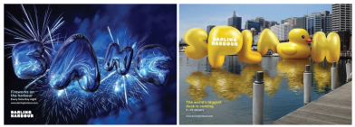
 (Image Source: Campaign Brief 2014)
Darling Harbour – not a city but an iconic part of Sydney had a re-brand, one of which “was designed to unite the entire precinct experience under one brand for the first time” (Campaign Brief, 2014). The ‘bubble’ typeface and the ‘giant duck’ promotes it as fun and exciting – which I agree with!
Sources:
Glickfield, E 2010. On Logophobia. Retrieved from http://onlineres.swin.edu.au.ezproxy.lib.swin.edu.au/522077.pdf
Canberra Times (2013, November 28) Born-again Canberra gets a brand Retrieved from http://www.canberratimes.com.au/act-news/bornagain-canberra-gets-a-brand-20131127-2yamx.html
Brand CBR (2013) Retrieved from http://www.contentgroup.com.au/casestudies/brand-canberra/
Campaign Brief (2014) Sydney’s Darling Harbour launches a new ‘inflatable’ identity via Interbrand Retrieved from http://www.campaignbrief.com/2014/02/sydneys-darling-harbour-launch.html

Reanna. You have touched on a number of design elements of each identity and included references for support – well done. Do ensure your analysis compares each of the selected identities, and results in the development of an argument on which of the two you feel is more successful.
LikeLike
Great post Reanna. I agree – Canberra is awesome! I actually didn’t mind the logo so much at first glance, but your analysis is spot on and made me rethink my opinion.
LikeLike